Data analysis means many thing to many people, but revealing trends and assessing quality are common goals. Map data can contain many types of features worth investigating, and how features are evaluated may vary based on how they will be used. OpenStreetMap data ranges in complexity due to the diversity of editors and the diversity of features they contribute. Reviewing a few cities in India demonstrates a bit of this complexity.
Read through for context or jump around to see how others are evaluating OpenStreetMap data, how community and quality are related, why India is interesting and methodology details, along with the specifics of roads, buildings, and points of interest in Bengaluru, Delhi, and Mumbai with links to all the queries and data used to generate a series of charts.
Data Quality 101
When measuring data quality, what exactly does that mean? One may try to formulate quantitative measures that characterize data as superior, complete, accurate, consistent, and current. Additional measurements may focus on documentation and source evaluation with respect to the reputation or authoritative nature of the data provider.
The original purpose of data collection and the original reference scale at which data was collected may also have bearing on the utility of the data for purposes beyond its original intent. With this in mind, data quality may be measured for specific use cases. For spatial data, a few examples include routing, search, and cartographic rendering.
Evaluating OpenStreetMap Data Quality
In recent years, researchers have developed a number of techniques to assess OpenStreetMap data quality. Analysis of the road network is common, but others have focused on other features like buildings [1]. While several [2-6] measure characteristics of OpenStreetMap data against authoritative sources, others take a community approach by evaluating the community of editors [7-9]. In many of these studies, the heterogeneity of OpenStreetMap data is described as a difficult characteristic to address in order to effectively compare it to any other data source. In actuality, this is the case even when comparing OpenStreetMap data to itself, but it should not be thought of as a weakness.
In addition to the common features found in all basemaps databases, OpenStreetMap has many additional types of features that cannot be found anywhere else. This is the result of the tag system of key value pairs inherent in the data model. Tags allows mappers to add virtually anything they can think of, and new tags can be created at any time. Some examples include garden types, piste (ski run) types, water slides, individual playground equipment, memorial benches along hiking trails, and the list goes on and on. While the ability to add new tags at any time allows for rich content, it can also make categorizing features difficult when similar features are tagged differently.
Complementing the various OpenStreetMap research efforts that have been published in peer reviewed journals, code repositories featuring OpenStreetMap data analysis tools are available from a number of contributors. In this space, find:
- iOSMAnalyzer: a python tool to generate data quality reports utilizing Osmium, OSM-History-Splitter, OSM-History-Render/Importer and MatplotLib for visualizing statistics.
- For tile based analysis, Mapbox offers OSM QA tiles to evaluate the current OpenStreetMap data.
- Find also nearly two dozen OpenStreetMap data quality checks, written in Perl by Gerhard Gary68.
- Try Keep Right for visualizing programmatically detected errors.
- Osmose also employs programmatic error detection and provides editing tools.
- MapRoulette is another successful project built around challenges submitted to fix themes of programmatically detected errors.
The subset of tools mentioned here demonstrates the commitment the OpenStreetMap community has towards building the best map possible.
Community and Quality
The relationship between community and quality is fascinating. OpenStreetMap data quality clearly benefits from an extensive community of editors. It is easy to imagine why this might be the case. More contributors leads to more content, and faster corrections when errors arise, including examples of vandalism like the introduction of fictional data or the inappropriate deletion of existing data [10].
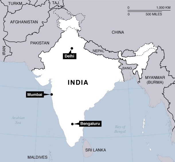
Characteristics of Bengaluru, Delhi, and Mumbai
With one of the fastest growing economies, and a steady rise in smartphone use, mobile maps are expected to play an important role in India. According to internet live stats, 19% of India's population had access to the Internet in 2014. Smartphone use was estimated at 10% of the population for 2014 by Statista, and there are several indicators that these numbers will continue rise.
What is happening in the world of OpenStreetMap edits for India? Here is a first look at Bengaluru, Delhi, and Mumbai with links to all queries used to generate the results presented in this blog post.
More about the OpenStreetMap data and how it was prepared for analysis:
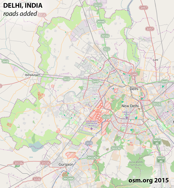
The full history dump of all OSM data under the ODbL license is published every Wednesday. As of this writing, the data is available as a 68 GB XML file, or a 47 GB PBF file. (By the time this work was presented at AAG, the XML file had grown to 74 GB and the PBF file reached 50 GB.) With one of these files, OSM History Splitter was used to split the data into smaller, manageable extracts for Bengaluru, Delhi, and Mumbai. From there, Osmium Time Filter was used to generate a snapshot in time for each year of interest, capturing all data that intersected a bounding box. Those bounding boxes are as follows:
| City | Bengaluru | Delhi | Mumbai |
| Bounding Box | 77.470261, 12.83296, 77.743858, 13.19844 | 76.83831, 28.404181, 77.343689, 28.88382 | 72.790878, 18.878559, 72.893707, 19.05402 |
| Source | woeid 2295420 | woeid 2295019 | woeid 12586539 |
The data was then imported into a PostgreSQL database with osm2pgsql using the same bounding boxes above to clip the data to those extents. Each year is an accumulation of all prior years, and only the most recent feature is present in the data. User names, version numbers, and timestamps were also imported with the help of osm2pgsql's "extra attributes" option.
With everything involved, it is a lot to install and configure. To make things easier, particularly since there are no pre-compiled packages available for Mac OS X where I do all of my analysis, Matt Amos put together a linux virtual machine with the tools necessary to run the history splitter and time filter. To make it easier to reproduce this environment, he also provided a vagrant file. The key to success is accessing a full history dump from a shared folder to get around space limitations within the virtual machine.
And now, on to the results of the analysis:
Roads
Starting with the kilometers of road, Bengaluru and Delhi have been increasing over time. Mumbai has been relatively stable, but digging a little deeper reveals some interesting details presented below.
See example query for this chart.
NOTE: In some cases, it is advantageous to include the relations in the calculations, but for simplicity, relations have not been included for this pass because they often duplicate length and/or area. Additionally, all road calculations presented here do not account for the presence or absence of dual carriageways.
By 2007, Bengaluru had 38 kilometers of road and Delhi had 48 kilometers of road. Mumbai's first roads were added in 2008. The percent increase of kilometers of road from one year to the next is positive in every year for Bengaluru and Delhi. In fact, the percent increase for Bengaluru and Delhi is quite literally "off the chart" due to the incredible amount of growth between 2007 and 2008. Mumbai sees a few years of negative growth or nearly no growth at all, meaning that Mumbai's debute year for roads was followed by relatively consistent editing in subsequent years.
Consider that this percent growth chart is just for kilometers of roads. Enhancements could still be happening in the form of additional tags added to existing road segments. In reality, there are only so many roads in each city. For this reason, the kilometers of road cannot continue to increase indefinitely. At some point, percent increase should decline. It is also worth noting that Mumbai is surrounded by water on most sides, is roughly the same size as Bengaluru, yet only half the size of Delhi.
While coverage, or in this case the accumulation of kilometers, is important, additional attributes can reveal valuable details about the type of editing taking place in these areas over the last 8 years. Surveying the data for evidence of local knowledge often yields fuzzy results, but populated tags and enhancement to geometries can still be extracted.
Many types of enhancements would not easily be possible for editors relying solely on aerial imagery while participating in arm chair mapping. Two examples below include road features with names and road features with oneway designations. In some parts of the world, the line type visible in aerial imagery helps identify a oneway road, but this isn't a global standard, and this technique of identifying road type requires relatively high resolution aerial imagery. With respect to names, this is where Mumbai shines. The total accumulated kilometers of road may be small in comparison to Bengaluru and Delhi, but the percentage of Mumbai roads with names is quite high.
Should it be 100%? Actually, no, not in many dense urban areas in India. There are many areas that rely more heavily on place names associated with residential sectors and landmarks. Of course that means it is very important to have the residential sectors and landmarks in the data.
See example query for this chart.
See example query for this chart.
There is an interesting relationship between kilometers of road edited and the number of segments edited. In years 2008 through 2014, the number of edits to existing features outpaces the addition of new features in nearly every year for Bengaluru and Delhi. Mumbai is doing its own thing and needs further investigation, but API changes might give us some insight.
With the number of segments rising faster than the number of kilometers in Bengaluru and Delhi, we are seeing a trend towards smaller segments or segmentation of larger features. This makes sense, and is even visually identifiable in this time series for Delhi.
When editors are faced with a blank canvas, the long easy highways are the low hanging fruit. A shift towards smaller segments over time likely indicates an increase in detail, and this is good! A community of editors is taking the time to fill in the gaps.
The graphics below show stacked bar charts for the kilometers of edits to new and existing roads each year overlaid with dotted line charts representing the number of road segments edited each year. New roads verses existing roads is an approximation derived from version numbers. Same data, two views, and each year is an accumulation of prior years.
Pairing the version numbers with the timestamps would allow us to identify how new or how stale a feature really is, and this is an extra step we plan to tackle in the future.
See example query for the segments added to these charts.
Buildings
Taking a look at buildings, it was a slow start for all three cities until 2009 when editing begins to become more apparent. Interestingly, Mumbai has a noticiable dip in 2012, while upward momentum skips a beat for Bengaluru and Delhi that year, too. License changes are likely at work here.
See example query for this chart.
In additional to overall coverage, there are a number of tags that add value to buildings. Examples include names, address information, type, and height. While aerial imagery can be used to digitize building footprints, the added value of additional attributes often comes from local knowledge.
The charts below break down the distribution of buildings with and without address information, along with the total area. The address information comes from two sources: tags on the buildings, and points with address tags that intersected the buildings. In all cases, there are very few full addresses. The query built to extract this information is very generous and tallies anything with a populated address field.
See example query for these charts.
Is this count precise? No. The queries focus entirely on polygons that have been tagged with the building key. It is entirely possible to digitize a building footprint, and tag it with a different key and value. This is apparent in the data when reviewing names that are clearly associated with buildings yet the building key is not populated. Overall, buildings that are not tagged as buildings are a small subset. In addition to names that can give us clues about features that are not tagged in a conventional way, an exhaustive evaluation of all tags in the hstore would intentify all kinds of interesting features and additional attributes.
Topological Relationships
A comprehensive analysis of data quality would include accuracy assessments. By the end of 2014, Bengaluru had 4,541 buildings, but how many of these polygons are accurate? Some of these polygons could very well be missinterpretations of aerial imagery, but it would take a party of ground truth observers to verify.
Without ground truth expeditions, we can look to topological relationships for some features that need further investigation. With respect to buildings, we can calculate the length of road that intersects with buildings. In these cases, either the building or the road may be in the wrong location. With Halloween just around the corner, a covered bridge inadvertantly tagged as a building might be an exception Icabod Crane would appreciate, but these aren't a common occurance in India.
Queries reveal interesting results for the kilometers of roads intersected by buildings in Bengaluru, Delhi, and Mumbai. Mumbai stays low over time, Bengaluru seems to be approaching a level of concern because buildings intersecting roads is atypical in the real world, and then there's Delhi on a roller coaster ride! It's cases like these that highlight an active community. Something was likely very wrong, and it got corrected. With any measurement, the analysis is incomplete without visualizing the actual geometries. While these types of intersections may appear to be accumulating in Delhi, it is possible that they are all valid.
See example query for this chart.
Are the remaining intersections between buildings and roads equally problematic? It depends entirely on the mapping application, and a break down of intersections by type can be used to evaluate the visual impact these features may have on rendering. In the case of these three cities, the primary and secondary roads are fairly clear of intersections with buildings. The bulk of the issues occur with the residential and service roads. For general definitions for these road types, see the OpenStreetMap wiki.
See example query for these charts.
Points of Interest
Points of interest are much easier to add once the roads are in place. They are comprised of things you might search for while using the map. Examples include businesses, parks, schools, airports, and many others. For Bengaluru and Delhi, road edits start to gain momentum in 2009 followed by buildings in 2010 and 2011 for all three cities. Points of interest begin to gain momentum in 2010 and 2011 as well.
A point of interest (or POI) is stationary, can have many attributes, and may be paired with an associated polygonal feature. There are many types of POIs so we have chosen to look at a subset comprised as those with populated aeroway, amenity, barrier, highway, historic, leisure, man made, natural, railway, shop, tourism, or waterway tags.
Bengaluru has significantly more POIs when compared to Delhi and Mumbai, but the distribution of what is being added is quite similar across all cities. It is helpful to remember that these types are not necessarily mutually exclusive. It is very likely that many of the shop POIs also have an amenity tag.
Editors and Points of Interest
Since the osm_user tag was brought in during the osm2pgsql process, we can identify the cumulative number of POIs attributed to each editor at the end of any given year where the edits represent the last edit for any given feature. There are many editors that can only claim one POI by this measure, while the bulk of the features were contributed by a small group of editors. This is the classic long tail distribution characteristic of many crowd sourced datasets. Seeing all of the osm_user names is a window into the community. The high percentage of Indian names is hopefully an indicator of local knowledge.
See example query for these charts.
These types of visualizations also highlight variations in editor preferences. The top contributors of POIs will not necessarily match the top contributors of roads or buildings. Editors tend to favor specific types of features [8].
So what have we discovered?
OpenStreetMap editors are making contributions in Bengaluru, Delhi, and Mumbai! Bengaluru is outpacing Delhi and Mumbai for roads, buildings, and points of interest, but a stream of editors are active across all three cities. Looking back through the years, a simple investigation of roads intersecting buildings tells a community story. In most cases, buildings should not intersect roads. When Delhi saw a spike in intersections, it was corrected. Further investigations could be revealing. Was vandalism at play? Were features incorrectly tagged? Did a large import take place that year?
Overall, OpenStreetMap in India may still have a long way to go. To really quantify the details, it is necessary to know how many kilometers of road there should be. According to The World Factbook, India had 4,689,842 kilometers of road in 2013. There may be local sources for the states and union territories to help break this number down. How many buildings should there be? How many points of interest are expected, and how close is OpenStreetMap to reaching those numbers?
Next steps
Why aren't more people analyzing the OSM history? It may have something to do with the difficulty of managing such a large dataset or the requirements of the tools needed to load the data into a database. Unlike the planet file that contains only the last edited version of every feature in OpenStreetMap, the history contains all versions and tools like osm2pgsql are not designed to load multiple versions of features. There are a few history tools available and they have been highlighted in this blog post. Most of them would run natively on OS X, and some on Windows, too. Unfortunately they do not have installers for OS X or Windows which makes them difficult to install.
To make the current OpenStreetMap data more accessible and manageable, Mapzen offers Metro Extracts, and they are quite popular. If historical metro extracts were available, would they also be popular? For starters, the historical OpenStreetMap data for the three cities featured in this blog post are available here and individual queries or sql to generate a table of select results are also in the repository for this blog post.
In addition to making the data more accessible, we need a flexible framework for data quality reporting. The assortment of stats presented here are just the tip of the iceberg and we will include the additional pre ODbL CC-BY-SA data in the future to really present the full picture.
Any analysis of OpenStreetMap should incorporate a measure of the data, and a measure of the community. A snapshot in time cannot capture everything we want to know about the data in the same way a snapshot communicates for other data sources because OpenStreetMap data is far more dynamic and heterogeneous than anything we might try to compare it to. The history is just as relevant as where the data stands today and the history presents clues to what can be expected in the future.
References
- Fan, H., et al., Quality assessment for building footprints data on OpenStreetMap. International Journal of Geographical Information Science, 2014. 28(4): p. 700-719.
- Kounadi, O., Assessing the quality of OpenStreetMap data, in Department of Civic, Environmental And Geomatic Engineering. 2009, University College of London. p. 80.
- Haklay, M., How Good is Volunteered Geographical Information? A Comparative Study of OpenStreetMap and Ordnance Survey Datasets. Environment and Planning B: Planning and Design, 2010. 37(4): p. 682-703.
- Ather, A., A Quality Analysis of OpenStreetMap Data, in Department of Civil, Environmental & Geomatic Engineering. 2009, University College London. p. 81.
- Haklay, M., et al., How Many Volunteers Does it Take to Map an Area Well? The Validity of Linus’ Law to Volunteered Geographic Information. The Cartographic Journal, 2010. 47(4): p. 315-322.
- Girres, J.-F. and G. Touya, Quality Assessment of the French OpenStreetMap Dataset. Transactions in GIS, 2010. 14(4): p. 435-459.
- Neis, P. and A. Zipf, Analyzing the Contributor Activity of a Volunteered Geographic Information Project — The Case of OpenStreetMap. ISPRS International Journal of Geo-Information, 2012. 1(2): p. 146.
- Bégin, D., R. Devillers, and S. Roche, Assessing Volunteered Geographic Information (VGI) Quality Based on Contributors' Mapping Behaviours. International Archives of the Photogrammetry, Remote Sensing and Spatial Information Sciences, 2013. XL-2/W1: p. 6.
- Mooney, P. and P. Corcoran, Characteristics of Heavily Edited Objects in OpenStreetMap. Future Internet, 2012. 4(1): p. 285.
- Neis, P., M. Goetz, and A. Zipf, Towards Automatic Vandalism Detection in OpenStreetMap. ISPRS International Journal of Geo-Information, 2012. 1(3): p. 315.